





The payment rail that changed what Indian apps look like
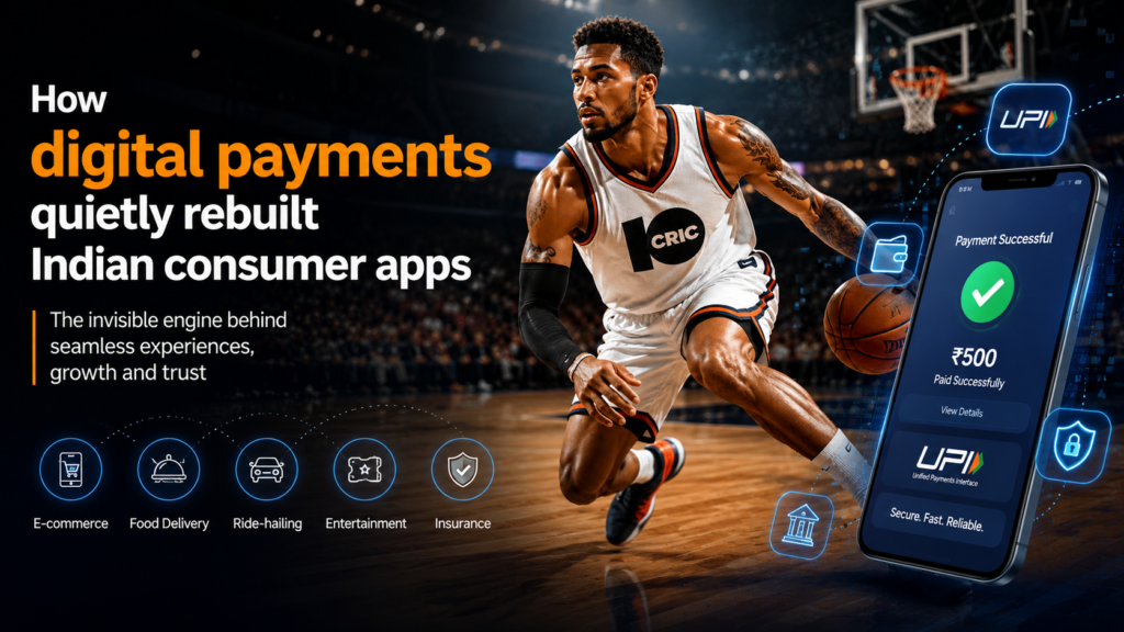
Ten years back, most Indian apps ran on a wallet-first logic. You loaded money in, spent it inside a closed system, then topped up again once it ran dry. That was the pattern behind ride-hailing, food delivery, pretty much everything. Then UPI showed up, and the old assumption — that money had to live inside an app before it could move — stopped holding. Companies that had spent years fine-tuning wallet balances suddenly had to rebuild around instant, account-to-account transfers that clear in seconds.
Why this mattered more for smaller companies
Big platforms could afford to absorb that redesign cost. Smaller teams couldn’t, and that’s really where the shift showed up. A three-person fintech startup didn’t need to strike a banking deal just to accept payments anymore; it could hook into a UPI switch and get the same rail a company twenty times its size was using. That flattened a cost structure that used to reward whoever had the deepest compliance budget.
You could see the ripple effect on checkout screens. Apps that once demanded a sixteen-digit card number, an expiry date, and a CVV started swapping all of that for a single QR scan or a UPI ID. Fewer fields meant fewer people abandoning the process halfway through, and quite a few product teams discovered that trimming down a form did more for conversion than any cosmetic redesign elsewhere in the app.
What “instant” actually costs a company
Instant settlement sounds like an unambiguous win, but it just shifts risk earlier in the pipeline. With card payments, there was a short buffer to catch fraud before the money actually left an account. With UPI, the transfer is often final within seconds, so fraud detection has to happen before authorisation, not after the fact. That’s pushed a lot of Indian tech companies to pour more effort into catching fraud before a transfer gets approved, rather than leaning on checks that only kick in once the money’s already gone.
It’s changed customer support staffing too. A disputed instant transfer can’t always be reversed the way a card chargeback can, so companies leaning heavily on UPI tend to put more weight on pre-transaction verification — extra checks on new accounts, or on unusually large transfers. None of this is visible to the person tapping “pay,” but it’s a big reason a well-built payment flow feels effortless while a sloppy one keeps throwing extra verification steps at you. For sports enthusiasts, staying updated with Breaking Cricket News can also provide timely information and updates alongside everyday digital experiences.
Where mobile-first industries adopted this fastest
Industries built entirely around mobile transactions had the biggest reason to move first, since their whole experience lives on one small screen with no desktop checkout to fall back on. Digital entertainment and real-money platforms were among the earliest to jump on instant payment rails, largely because their users expect deposits and withdrawals to clear fast. Anyone comparing how online betting games handle account funding against other apps will spot a similar set of priorities: fewer form fields, quicker verification, a payment flow built for speed. High transaction volume paired with low tolerance for friction probably pushed these platforms to lean on their payment vendors for faster rails sooner than a lot of other sectors did. For anyone using such platforms, it’s worth remembering these are meant for entertainment within a set budget, and are restricted to adults.
The design lesson other companies borrowed
Once instant payments turned into the norm across a handful of high-volume sectors, other companies started copying the interface patterns even where their actual transaction volume didn’t call for it. E-commerce sites picked up single-tap UPI confirmation. Subscription services swapped manual monthly renewals for autopay mandates. The interface language spread quicker than the technical need for it, which happens a lot in software: a solution built for one industry’s constraints gets reused elsewhere simply because users now expect it everywhere.
That created a side effect nobody really planned for. Users who’d gotten used to one-tap payments on a food delivery app started expecting the same simplicity from a tax filing portal or an insurance renewal page, where the process is genuinely more involved and can’t be squeezed onto one screen without losing something important. Some companies dealt with this by hiding the complexity behind progressive disclosure — a simple screen up front, detail revealed only if you go looking for it. Others just cut corners and left users unsure what they’d actually signed up for. For more updates, discussions, and useful content, users can join Telegram and stay connected with the latest information.
What to look for if you’re evaluating a payment flow
- How many fields does the checkout actually require, and could any of them be dropped without weakening security.
- Is fraud checking happening before the money moves or after, and does the app say anything about it.
- Are refund and dispute paths as easy to find as the payment button itself.
- Does the app quietly add friction for new accounts or unusually large transfers — often a sign of a maturing risk model rather than a flaw.
None of this requires a technical background to ask about. These are the same questions a careful product manager would run through before shipping a checkout screen, and they’re a decent way to tell whether a company treats payment design as a real discipline or something bolted on as an afterthought. A well-designed Android App and IOS App should also make the payment process simple, secure, and easy to navigate, giving users a smooth checkout experience across different devices.